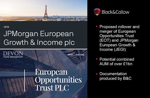
23/10/2025
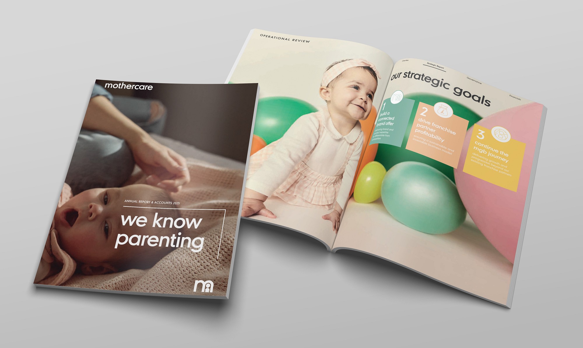
We're delighted to have helped our wonderful client Mothercare plc with another stunning Annual Report.
The design presents a visually clean and contemporary layout that reflects a refreshed corporate identity and a progression from last year's design. Ample white space, defined typography and the use of Mothercare's unique, restrained colour palette create a calm, professional tone that complements the brand’s heritage positioning. The use of strong headings, high-quality photography and clearly delineated sections supports readability and ease of navigation - whether by investors, analysts or other stakeholders.
Infographics and charts are integrated in a way that highlights key performance metrics while the subtle branding cues (such as the company’s signature colour and imagery of family/parent-child scenarios) anchor the document in the world of parents and children, reinforcing the brand link. The overall effect is one of an accessible, well-structured document that balances corporate professionalism with the warmth of a well-known and well-loved consumer-facing brand.
If you’d like to find out how we can help your Corporate Reporting work harder for you, chat with us today: hello@blackandcallow.com